Poster Layout Design
Exercises which focus on the development of different styles of poster layouts.
Selective Color
These posters are contemporary advertisements which utilize a single focal color among a monochromatic grayscale color palette. Each of these spreads were made predominantly in Adobe InDesign, with some image adjustments made using Adobe Photoshop. The use of color makes the designs feel more sleek and modern, allowing the focal color to highlight the important aspects of the designs.
M•A•C: This layout heavily utilizes the minimalist style, offering very little more than the necessary information required for the advertisement. Featured prominently is one of M•A•C’s most famous models, Lisa, whose face has almost become synonymous with the brand. For color, I originally planned to go with an iconic saturated red, a very common color to see in lipstick, but because another of these posters uses red as the focal color, I opted to go for a nice fuscia instead. The bar of color stretching across the spread not only gives a place for the text to sit (which admitedly is rather difficult to see at this scale), but I also ran the bar over Lisa’s lips and the bottle of lipstick she is holding, aligning the color to where it would belong on her face. Lisa’s black coat provides the perfect canvas for the M•A•C slogan I chose to include in this spread: “All Ages, All Races, All Sexes.” M•A•C has quite a few slogans they are known for, but I wanted to use this particular one as it resonates with me personally and seemed to fit the aesthetic of the piece the best. When the spread is folded, the slogan gets split down the middle, but it is not very likely to be viewed in this manner. To add a bit more color, I implemented the lipstick smudges behind Lisa, which I changed to fuscia to match the focal color.
Starbucks: This poster allows for the iconic focal green color to take over the spread, giving the spread much more energy while technically maintaining a considerable amount of negative space. The arrangement of the text was really the only thing I felt needed revisiting after the first version of this spread was developed. I enjoyed the diagonal symmetry created by the image in the bottom left and the text in the top right, however the alignment of the text felt a bit unprofessional overall, and adjusting the justification to the right did not really fix the problem. As a solution, I opted for a sort of 2/3 composition, with the main text and the image aligning nicely to the left, taking up around 2/3 of the poster area, while moving the slogan from beneath the image to the right edge of the poster and rotating it, allowing the slogan to take up the remaining 1/3 of the area on the right side. As evident by the logo in the image, the green used throughout the poster is not the exact same as that of the Starbucks logo, however I felt that this was more than sufficient as recognizable to the brand. To avoid leaving the grayscale hand floating in a sea of forest green, I added a window for the hand to peek through and appear behind the color, using the titular star shape to bring the design together.
Wüsthof: Another obvious choice for the focal color, the saturated bright red used through the company’s branding was by far the best option to make this spread pop. Starting with a split of a red and white, I cut shapes into the red and used those shapes to define the red in other areas of the image, giving the impression that the area of red had been cut into by the knives advertised and sold by the company. Using these sliced shapes as guidelines, I organized the text to follow along with the cutting motion created. This does have the effect of making the text a bit more difficult to read because of its rotation, but the orientation of the text is still level enough that it shouldn’t be too big of an issue. Not to mention, this spread is best viewed printed out, which would allow the reader to physically rotate the poster. I wanted the main imagery for this spread to be the cutlery distributed by Wüsthof, so I added one of their knives behind the primary red shape, allowing the silver and black of the blade and handle to peek through the slices. I overlayed the company’s logo atop the knife, which allowed it to peek through there as well. The alignment of the knife and the slice motion which contains the text also give the composition a very satisfying “V” shape.
Imagery and Type
This project focuses on the relationship between text and imagery, how they can mingle and successful ways to allow them to work together to inhance a design. The focus for this exercise is an oganization known as Doctors Without Borders (Médecins Sans Frontières), the instructions were to include their tagline as well as a sort of mission statement from the group within the layout, while also using imagery to elevate type and vice versa.
This spread is an example of type within imagery. I intermingled the DWB slogan with this crowd of people waiting for medical care and refuge. My intention was to highlight the crowded conditions of this particular scene and allow the reader to explore the image by coaxing their gaze with the big white text in the center. I had considered aranging the text of the slogan to be moreso behind the chainlink fence featured behind the people in this image, but locking the slogan which includes the term “medical care” behind a fence would create the wrong impression, which is something I very much wanted to avoid. Because the image on the left is quite busy and colorful (despite being in grayscale) I opted to keep the right side much mre simple, with the header and body text situated in the middle of the page. The alignment of the text also worked out quite successfully in unifying the two very different sides of the spread, with the top of the text aligning closely with the tops of the heads of the three prominant women in the image on the left, as well as almost making a heart shape in the middle.
Another example of type within imagery, this is a much more intense and compelling piece of imagery: a group of volunteers carrying someone, likely on their way to administer emergency medical treatment. I wanted to include the text of the slogan right in the center of the action, not only to draw the eye to the people themselves, but also to highlight the sense of urgency of this image, almost as though the people in the image are rushing quickly past the text, connecting the text with those who are fulfilling it. Instead of having another stark departure between the sides of the spread, I decided to fade the image into a white background arounf 3/4 of the way to the left, where the text can take the place of the image, again in a simple central location in terms of verticality. Unlike the rest of this set of spreads, I decided here that I would put the word “most” in the DWB slogan into all capitalization, again highlighting the severity of this particular image. This is by far the most intense image I used throughout this series, so I wanted to reflect that in the nature of the text itself.
One of the two examples of imagery within type, this is a bit more of a subtle example, with the text and the imagery almost introducing themselves into each other’s space equally. I wanted to include this image, which is much wider than most of the others I have used, so I opted to make it a sort of banner and allow it to transition to a white space below with a bit of help from the text. A major goal with this project was to utilize pathos to evoke emotion from the viewer, as well as to provide proof and examples of the difficulties many people face everyday that a majority of the world is blissfully ignorant of. A rather successful method of evoking pathos is using children as the muse of the piece. Seeing children going through such hardships can be quite a moving and compelling sight. I wanted to include this image of a young mother and her infant child for this reason. The text I decided to align in a bit of a diagonal manner, with the slogan text on the top left of the white space and the body text on the bottom right. Along with this, I used the MSF logo as diagonal symmetry for the doctor in the image.
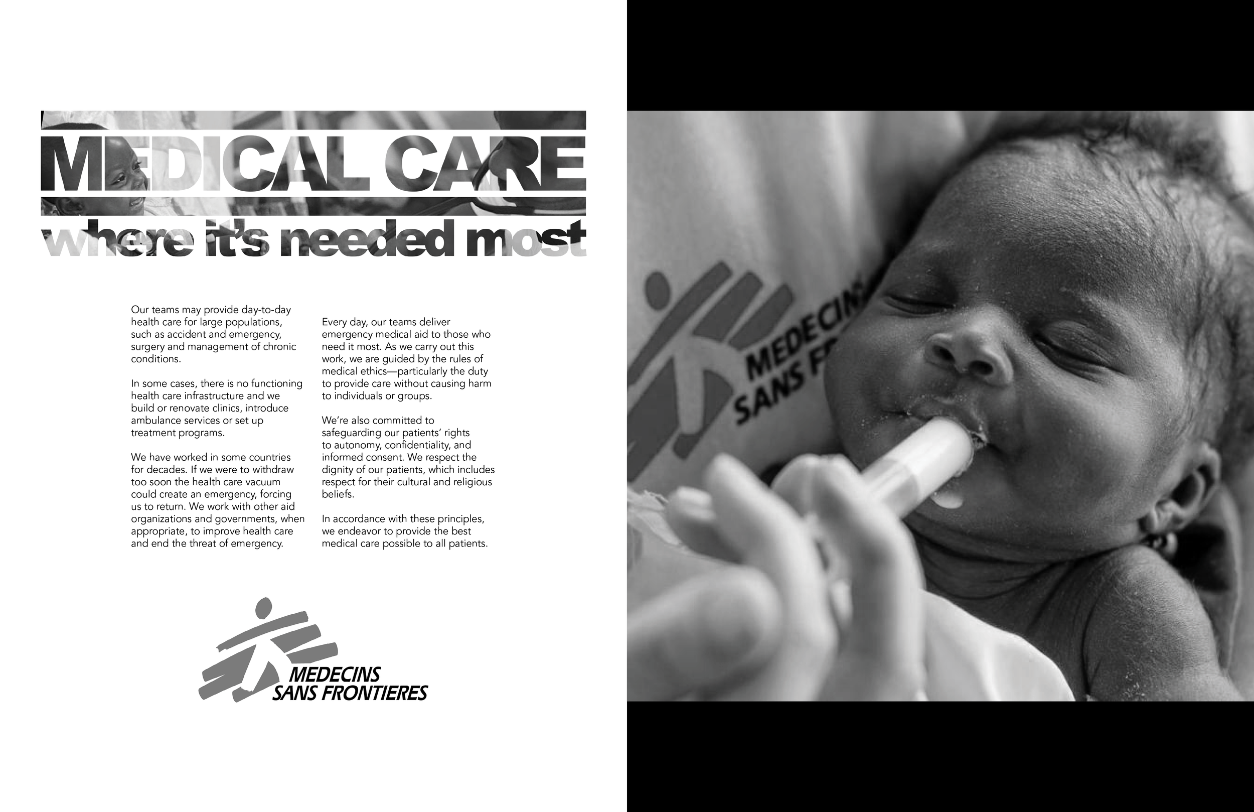
The second instance of imagery within text, this example is a bit more literal at the unfortunate cost of obscuring quite a considerable amount of the image. Within the DWB slogan, I inserted an image of a doctor caring for a young baby (in honestly one of the cutest photos I have ever seen), and I played with the text to try and reveal more of the image, focusing mainly on the baby’s face and as much of the doctor’s face as I could. The baby’s face is incredibly visible on the left side of the image, but the doctor’s face, being already a bit obscured by the angle and crop of the image, was a bit more challenging to incorporate. I had to settle with opening the text to allow his nose and brow ridge to pass through. Most of the rest of the image fades into ambiguity among inside the rest of the text, but I still feel as though the attempt was somewhat successful. I added the body text below the slogan, along with the MSF logo, leaving nothing to designate the right side of the spread. To avoid a totally white spread, I added an image of a young child being fed and nurtured, which I feel is mildly successful a solution.
Minimalism Exercises
While there have been other instances of poster design featured which exhibit a more minimalist approach, these particular projects carry the specific intent of embracing minimalism as opposed to utilizing it as an extra design feature.
Porsche Model 911
This series of advertisements focuses on the Porsche brand, specifically the release of one of its newer models at the time: the Model 911. The brief was to create three different layouts using the minimalist style, a spread, a tabloid, and a website landing. Each of the designs needed to include a few key elements which needed to be displayed in every advertisement:
An image of the Model 911 itself
The name of the car (911)
The Porsche logo (iconography and/or logotype)
A quote from Porsche’s founder
One of Porsche’s company slogans
A brief exerpt of text written by the Porsche company
The project needed to be monochromatic grayscale, the only instances of color allowed coming from the minimal color on the car itself (the gold seal on the hood, for instance).
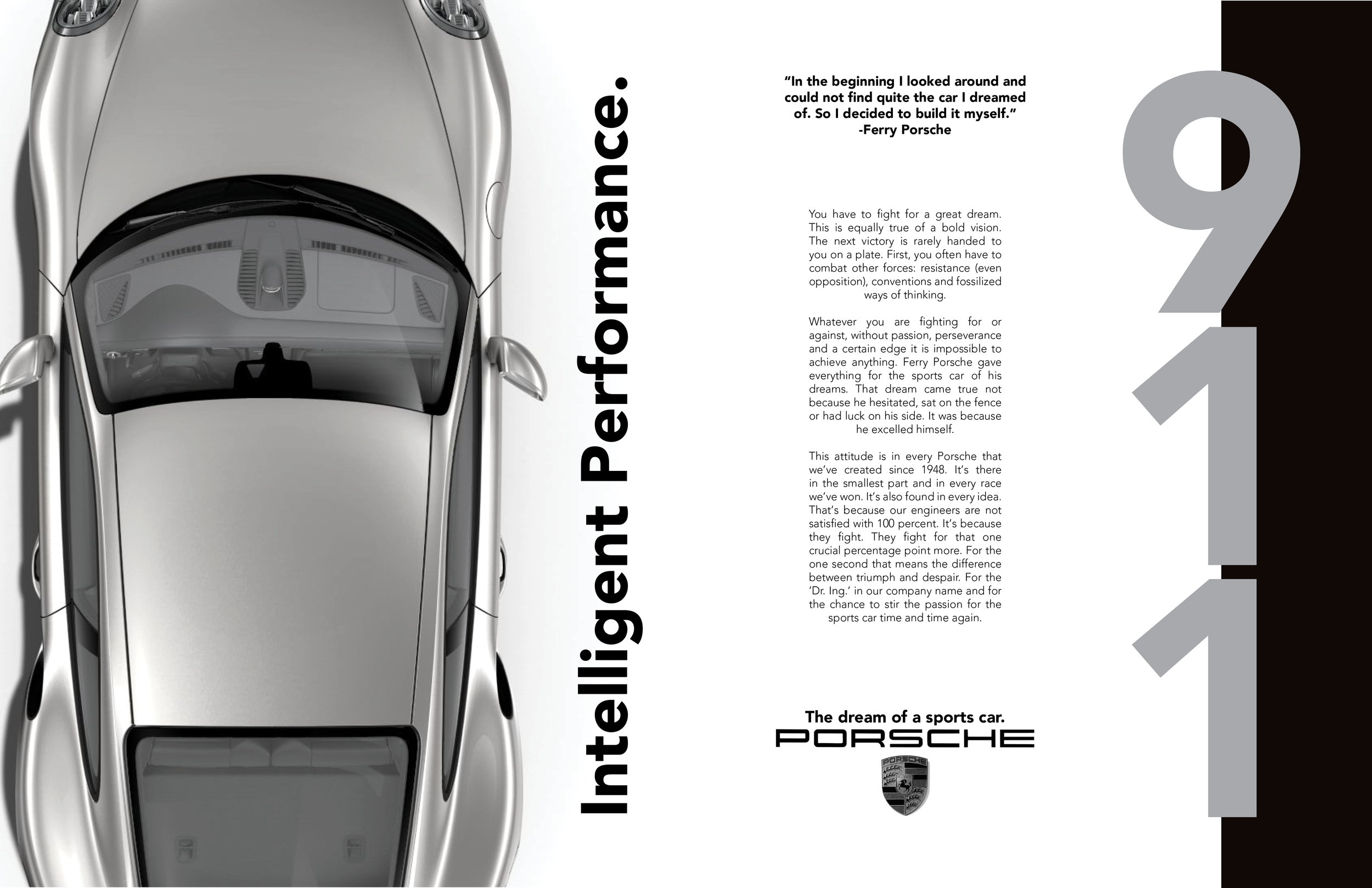
For the spread I opted to allow the car itself to take over much of the left page, having it run off the edges in place to avoid it looking as though it were floating in the negative space. The black bar on and large “911” on the right help create symmetry with the car, with the text and logo meeting in the middle of the two. Although the instructions were to include one of Porsche’s signature slogans, I opted to use the two most popular to add a bit more to my design, those being “Intelligent Performance,” and “The Dream of a Sports Car.”
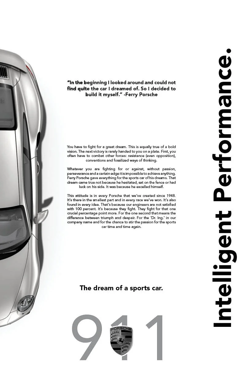
For the tabloid, I wanted again a vertical composition with long elements of symmetry running along the sides. For this design, I felt the car itself took up a bit too much room, so I cut it down the middle and used half of it for the design, which allowed for much more cohesive symmetry with the slogan on the right. The text in the middle is rather symmetrical as well, with the second slogan and the quote nicely encapsulating the body text. I decided to combine the logo with the car model and used that as a source of symmetry with the white space on the top of the spread.
Admittedly, website design is one area of graphic design where I tend to struggle. This project was actually my first experience with website design, so here I would say this particular facet of the project was less than stellar, though I can say I have improved as a website designer since then, even if I still feel that may be one of my weaker skills. The composition in this particular design is fairly basic given my lack of confidence with this format, having an obvious alignment of elements split down then middle, the picture of the Porsche 911 paralleling the slogan, the name of the car reflecting the body text, and the quote parallel with the blank space between. I was less concerned about the header and footer of the site, so they remain simple.
Gam3 Advertisement Spreads
This project focused on design layout development for local businesses in the Terre Haute area; the subject needed to be a small company born and raised in the city of Terre Haute, or a fairly larger entity which originated here. I chose to focus this spread on a business called Gam3, which was a small game shop, mainly dealing in table top and role playing games, offering a space for people to come in and play all sorts of games, whether brought by customers, or pulled from Gam3’s personal library.
Both of the spreads here I would say turned out somewhat decent. The imagery used for the spreads I had to gather on my own, and so without access to a professional camera of any kind, I had to take the pictures for this project with my phone, limiting the quality of some of the images, which really hold the designs back from looking truly professional. I opted for a monochromatic grayscale, which in hindsight I would rather have avoided. I did this to limit too many colors cluttering the composition, but as a result the lack of color takes away from the fun and recreational energy this type of business is meant to project. I implemented an example of imagery within text and text within imagery in each respective design, both of which I feel are mildly successful. Overall there are quite a few things I like about these designs, with things I’d like to fix as well if I took the time to revisit these spreads.


