
Oyster - Creative Inspiration
A high fidelity concept for an application designed to combat creative block.


Oyster is a culmination of a semester of work towards developing an understanding of proper application of UX/UI techniques via hands-on experience through development of a high fidelity app concept.
The purpose of Oyster is to combat creative block by allowing users to generate a random assortment of inspiring stimuli arranged into moodboards. Users will utilize these boards to make some form of creative work with the hopes of breaking the user from their creative block. Eliminating the ability to choose the concept of their work allows the user to move past the mental barriers which can develop from burn out of an overall lack of inspiration.
Once users have completed their works, they will have the option to upload their works alongside the generated moodboard to a linked Facebook and Instagram account as well as onto Oyster’s personal social media platform. This allows people to compare works using the same or similar elements to further envoke inspiration in a community environment.
One of the first steps to fleshing out the vibe and style of the application was to, ironically, develop a mood board which would help represent the feel of the website once it was further developed. I knew because the application is based upon artistic work and creativity, I didn’t want a terribly limited color palette or range of available colors, as this was likely to be prevalent regardless through the myriad of images which would generate for users.
Once I had established the mood of the application and what aspects of user experience are most important, the next step was to create a branding board which would contain the unifying elements of my application into one space which could be referenced to assure cohesiveness was maintained throughout the app. While I wanted the app in general to be colorful, I figured that the generated images would do much of that work for me, therefore I opted for a toned back branding style as a means to avoid competition between the images and the style of the app itself.
To help simulate the type of user which may find themself using this application, I created the persona of Allison Berry to assist in the devlopment process. Allison serves the purpose as the “test user” for the application, with the high fidelity prototype being focused from her perspective, with actual user testers viewing this as proof of concept.
An empathy map was developed to help get into the head of the average user of the Oyster app in order to deduce why it is that they would want to use this app.
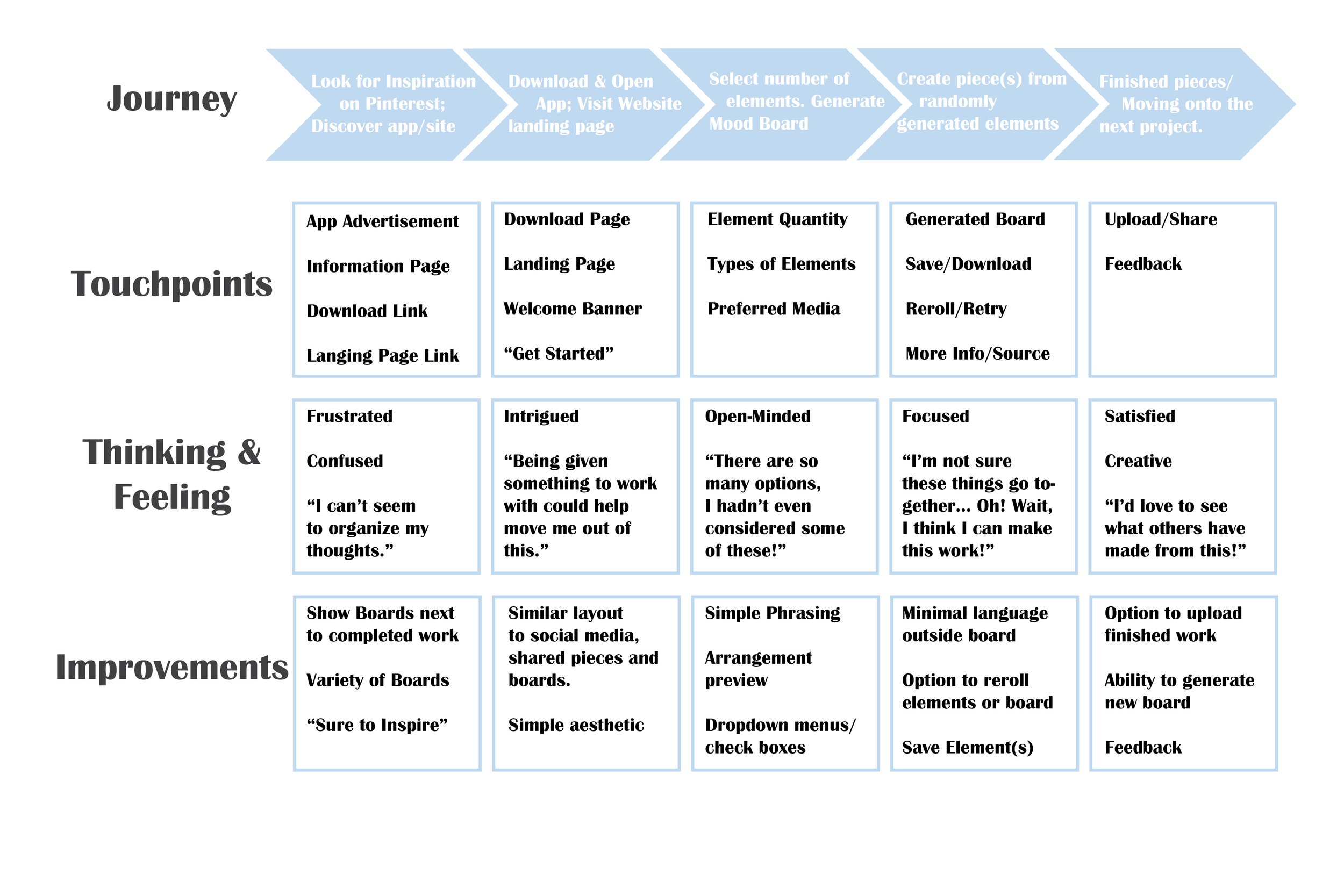
An experience map was created in order to highlight the journey a user might take when going through the process of discovering the application, all the way from developing the feeling of creative block to searching around for potential remedies all the way through the process of using the application for the first time, with the process being assumed to repeat.


In order to discern what aspects of the application would be pertinent in maximizing the user experience, I developed a group of concepts which I felt would be necessary to include in the app design through the Crazy 8’s ideation method.
After developing these necessary functions for the app, I reorganized the 8 ideas from least to most important (in my opinion) to the success of the application.
After establishing the identity of the persona and developing the emathy and experience maps, it was time to visually layout the experience of a first time user of our application through use of a storyboard of 15 frames. Obviously this is not going to be the same experience of all users, but for the sake of appealing to a “perfect” audience, this story board adequately highlights the usefulness of the application in the purpose of combating creative block.
It was around this point that a name for this application needed to be developed. After brainstorming a group of potential naming concepts and running them through a group of peers, the name Oyster was selected.
The name Oyster references the saying “the world is your oyster” which means that anything you desire can be yours if you put your mind to achieving it. This also has a pretty literal meaning towards actual oysters, and particularly the pearls they often have within their bodies; a shining treasure hidden in a place one may not expect to find unless you go looking for it.
As we near the point of taking all this work into Adobe XD for the first time, it became necessary to develop a user flow chart to help visualize a general layout of the important areas within the application. Because this app is meant to have a functioning social media system, those elements were generalized into sections including the Profile, Public Feed, and Trending Pages as proof of concept. As work began on the low fidelity prototype, it becamoe necessary to further flech out this layout in the moment to make it more easily navigable and intuitive for users.
And here is the culmination of this research and development: a high-fidelity prototype of how the app would function as a fully fleshed out application, with many of the more advanced (or more tedious) features being shown in a more simple stage as proof of concept.
Because I worked on this project as a team of 1 over the course of 16 weeks, I determined I didn’t not have the time nor the resources to establish a fully functional social media system as well as a competent and learning AI of images for the app to filter through when generating mood boards.