
Magazine Layout Design
Examples of projects dealing particularly with layout design of magazine spreads.
National Park Magazine
The goal of this project was to focus on layout design for a piece of informative media, heavy in text and with need for imagery to break up the paragraphs. Specifically, the instructions were to select a national park to create a fictional park guide which would explain the history of the park and offer plenty of informative resources for the reader. For the focus of this magazine, I chose Yellowstone National Park. The name gave me the perfect color palette to use: one focusing around the color yellow. Adding the greens and browns of the park’s forests and the oranges and reds of the mountains allowed for a beautiful synergy of colors to blend together throughout the design.

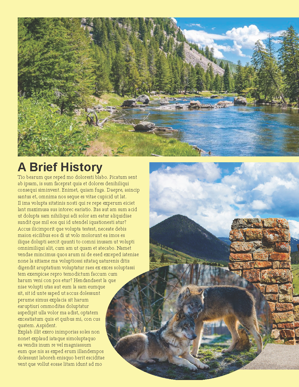
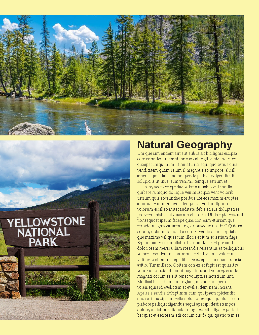

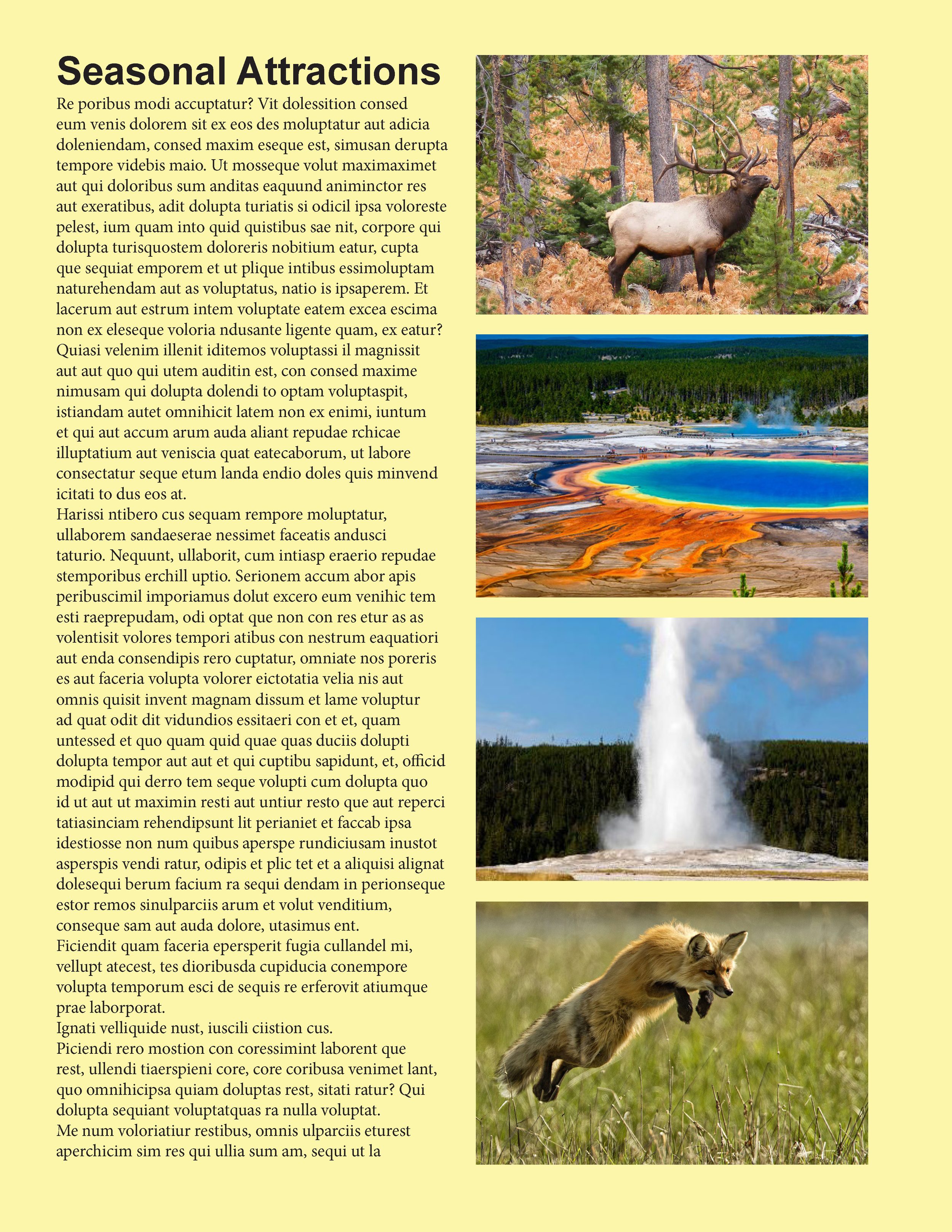

I wanted to add a few instances of rounded images and curved corners to a few images to add movement to the layout, while including plenty of images of the natural grandure of the park. From the sprawling forests and mountains, to the iconic geysers and hot springs of the park’s central calderafor which Yellowstone is most famously known. Plenty of pictures of wildlife as well add even more to the majesty of the park, enticing the reader of the sights ahead.
Betty White: Golden Century
Another project which had a focus on layout design, specifically of a magazine spread, the intention of this piece is to cover a celebrity or similar person of note, and create a magazine spread focused on them, using a piece of preexisting media written about them. Around the time I made this project, Betty White’s 100th birthday had recently passed, so I chose her as the focus of this article. I grabbed an article from Parade, and used that as the verbage for this project.
During the development of this particular project, I was struggling considerably with my own sense of confidence in my artwork, especially when it came to layout design. Because of this, there are two different versions of this project: one which I would describe as overall a failure, and then a revised version which I feel is considerably more successful.
For the sake of displaying some form of artistic growth through the overcoming of a creative block, I have included both versions, explaining what I dislike about the first version, and the solutions I used in the second version.


The biggest issue, in my opinion, with the original version of this layout is that it ended up being far too crowded, with so many things to look at and so many clashing elements, it became a bit overwhelming. The original plan was to utilize quite a bit of the color yellow, to match along with the gold accenting I wanted to use, as it would match the title of the article “Golden Century,” which pays homage to one of Betty White’s most famous performances, that of Rose on Golden Girls.
To add a bit more color, I opted to introduce purple as a compliment to all the yellow and gold of the piece, and while I do think they colors look nice together, especially being toned down to a more pastel, In the end I went a bit overboard with detailing, making things far too complicated. The yellow bubbles at the bottom of the pages, which pay tribute to Betty White’s effervescent and jovial demeanor, steal much of the attention away from the actual text of the article, which also fades away into the light purple background; with the white of the text not standing out nearly enough. Combining that with all of the extra colors added in with each of the pictures of Betty with her flashy wardrobe, the design becomes more than a little difficult to look at.
With all of this in mind, I elected to start the project nearly from scratch, taking some time to reevaluate my approach and work towards a compromise which would allow me to make the layout more visually tasteful while still maintaining some of the character I wanted to be present to represent Betty herself.


I decided that it was necessary to remove one of the two main colors, either the purple or the yellow. I opted to keep the purple over the yellow because I felt it would allow the gold accents, which I also wanted to somewhat maintain (even if I decided to remove all the extra detailing clutter), to stand out more on its own. While I did quite enjoy the banner of images throughout Betty’s life which I had on the first spread, I felt that those images ultimately did little to contribute to the design itself. I allowed the floral pattern to become the central focus of the background, toning back the saturation to give the text and images more of the spotlight, while also allowing the pattern to blend into the white behind it and along the edges. This ended up giving the illusion that the rest of the background was actually a faint lavender color, as opposed to opaque white, which adds quite a bit of cohesiveness to the design in my opinion.
I wanted the images to play a more important part in the design, so I chose a few which I felt would serve the design well, isolated Betty from the backgrounds, and used her form to dictate where the text, which I changed from opaque white to a dark purple, could flow and sit around her. The images within the article itself I dulled down their saturation and gave a bit of a cool coloration to let them blend into the design without introducing too many new colors, especially the image of Betty with the birthday cake, which you can see from the first version of this spread, introduces quite a few new colors. As for the image on the title page, I opted to leave Betty with the correct saturation, while just changing her blouse from red to more of a majenta, but looking at it now, I feel as though it may look better (or at least more cohesive) if I had slightly desaturated her there as well, as that image stands out quite a bit compared to the rest as it is now.
I elected to maintain the gold accents strictly in the expressive typography, which while it looked nice, unfortunately was still subject to a bit of fading away into the background. The remedy this, I introduced a few instances of an earthy blue, which would sit behind the gold to allow it to pop. I also used this blue as the color of the paragraph headers throughout the design, which helped the blue fit more into the design.
Overall I am immensely more pleased with this second version than its predecessor.